几个月前花了一周多学了点前端,但也只是浅尝辄止,实战中还是由于css底子不好导致了很多布局的问题,故沉下心来再次把css复习了一遍,理顺了实战中遇到的一些布局问题,包括多浏览器、不同尺寸屏幕的适配问题也更加清晰了许多,有关适配性的经验将会在另一博客中着重总结,此博客主要针对css的基础布局进行梳理,方便复查!期间,也发现了一个查前端文档的网站:MDN
定位

相对定位
以当前为参照物移动指定的距离
注意:相对定位,被定位的元素会占据原有的物理位置
1
2
3
4
5
6
7
8
9
10
11
12
13
14
15
16
17
18
19
20
21
22
23
24
25
26
27
28
29
30
31
32
33
34
35
| <!DOCTYPE html>
<html lang="en">
<head>
<meta charset="UTF-8">
<title>相对定位</title>
<style>
div{
width:200px;
height:200px;
}
#box1{
background: red;
}
#box2{
background:green;
/*相对定位
以当前为参照物移动指定的距离
注意:相对定位,被定位的元素会占据原有的物理位置
*/
position:relative;
top:200px;
left:200px;
}
#box3{
background: blue;
}
</style>
</head>
<body>
<div id="box1"></div>
<div id="box2"></div>
<div id="box3"></div>
</body>
</html>
|

绝对定位
绝对定位的元素不会占据原有的物理位置
以其他元素作为参考物移动指定距离的定位方式
关于绝对定位的参考点:
- 如果元素的外层元素是非static(有了除默认值之外的定位设置)那么这个外层元素就成为该元素的定位参考点
- 如果元素的外层元素没有设置任何position的值,那么该元素将寻找距离自己最近的其他设定过position的外层元素作为参照物(必须为嵌套层)
- 如果该元素的外层元素没有任何一个元素采用position定位,那么此时定位参考元素变为body或者说页面
1
2
3
4
5
6
7
8
9
10
11
12
13
14
15
16
17
18
19
20
21
22
23
24
25
26
27
28
29
30
| <!DOCTYPE html>
<html lang="en">
<head>
<meta charset="UTF-8">
<title>绝对定位</title>
<style>
div{
width:200px;
height:200px;
}
#box1{
background: red;
}
#box2{
background:green;
position: absolute;
/*top:200px;
left:200px;*/
}
#box3{
background: blue;
}
</style>
</head>
<body>
<div id="box1"></div>
<div id="box2"></div>
<div id="box3"></div>
</body>
</html>
|

加上
top:200px;
left:200px;
参考点为(0,0)绝对左上角,而不是红色框左上角

如果外层元素没有定位,但是外外层(爷爷类)有定位,则有:
- 如果元素的外层元素没有设置任何position的值,那么该元素将寻找距离自己最近的其他设定过position的外层元素作为参照物(必须为嵌套层)
子类参考点为外外层(爷爷类)
1
2
3
4
5
6
7
8
9
10
11
12
13
14
15
16
17
18
19
20
21
22
23
24
25
26
27
28
29
30
31
32
33
34
35
36
37
38
39
40
41
42
43
44
45
46
47
48
49
50
51
52
53
54
55
56
57
58
59
60
61
62
63
| <!DOCTYPE html>
<html lang="en">
<head>
<meta charset="UTF-8">
<title>绝对定位</title>
<style>
div{
width:200px;
height:200px;
}
#box1{
background: red;
}
#box2{
width:500px;
height:500px;
background:green;
border:1px solid green;
/*绝对定位:
绝对定位的元素不会占据原有的物理位置
以其他元素作为参考物移动指定距离的定位方式
关于绝对定位的参考点:
1.如果元素的外层元素是非static(有了除默认值之外的定位设置)那么这个外层元素就成为该元素的定位参考点
2.如果元素的外层元素没有设置任何position的值,那么该元素将寻找距离自己最近的其他设定过position的外层元素作为参照物(必须为嵌套层)
3.如果该元素的外层元素没有任何一个元素采用position定位,那么此时定位参考元素变为body或者说页面
*/
position: relative;
}
#father{
width:200px;
height:200px;
background: aquamarine;
margin:20px;
}
#son{
width:100px;
height:100px;
background:fuchsia;
position:absolute;
top:100px;
left:100px;
}
#box3{
background: blue;
}
</style>
</head>
<body>
<div id="box1"></div>
<div id="box2">
<div id="father">
<div id="son"></div>
</div>
</div>
<div id="box3"></div>
</body>
</html>
|

如果son的father没有定位,box2也没定位,则其absolute参考点为body:

固定定位
垂直滚动条:
background:palevioletred;
1
2
3
4
5
6
7
8
9
10
11
12
13
14
15
16
17
18
19
20
21
22
23
24
25
26
27
28
| <!DOCTYPE html>
<html lang="en">
<head>
<meta charset="UTF-8">
<title>固定定位</title>
<style>
div{
height:2000px;
background:palevioletred;
}
#box{
width:80px;
height:400px;
background: green;
position: fixed;
right:0px;
top:300px;
}
</style>
</head>
<body>
1
<div>
<div id="box"></div>
</div>
2
</body>
</html>
|

堆叠顺序

注意:只能支持定位元素!!!
1
2
3
4
5
6
7
8
9
10
11
12
13
14
15
16
17
18
19
20
21
22
23
24
25
26
27
28
29
30
31
32
| <!DOCTYPE html>
<html lang="en">
<head>
<meta charset="UTF-8">
<title>z-index设置定位元素z轴的距离(定位元素的显示顺序)</title>
<style>
#one{
width:200px;
height:200px;
background: red;
position: absolute;
top:100px;
left:100px;
z-index:1;
}
#two{
width:200px;
height:200px;
background: yellow;
position:absolute;
top:150px;
left:150px;
z-index:999;
}
</style>
</head>
<body>
<div id="one"></div>
<div id="two"></div>
</body>
</html>
|

首先看代码先后顺序,渲染的是one在前,two在后,所以黄色会盖住红色,z-index可以提高层级别
display
回顾浮动:任意元素一旦浮动,display都会失效
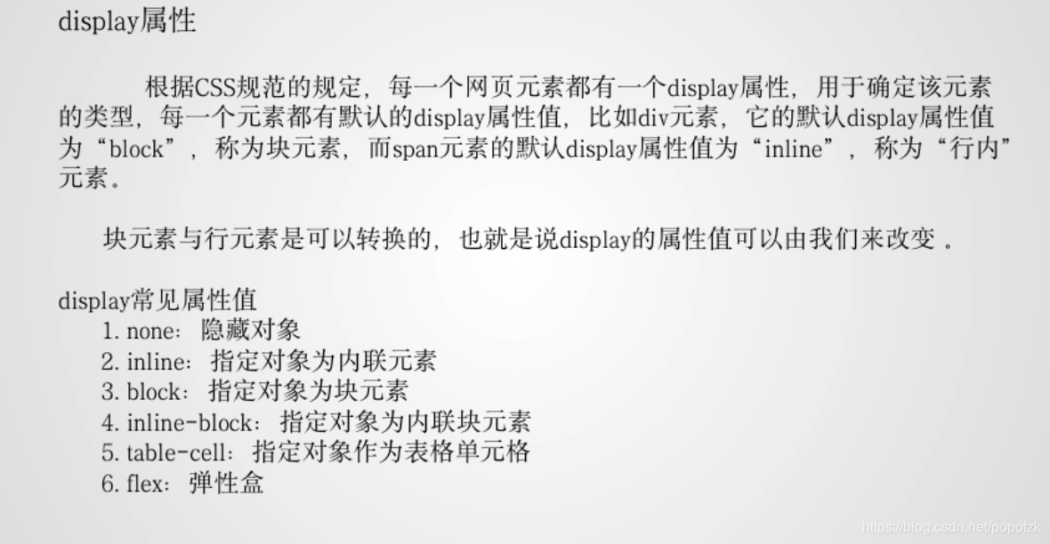
预备知识:
- div:默认为块状元素:具有宽高属性,并且独占一行
- Span:默认为行内元素:没有宽高属性,不会独占一行
块状&行内元素的互换:
- 如果将div设置为行内元素
display: inline,则会使得div无宽高属性,且不会独占一行!
- 也可以将span设置为块状元素:
display:block,则可以有宽高属性,独占一行!
- 如果用了很多块状元素div,但是会独占一行,如果不想独占一行(想并列显示),则要将其改为 行内块元素:
display:inline-block——既有宽高属性 且不会独占一行,但涉及图文混排,故此方式用的较少,浮动使用较多
- 接着将div的display改为表格属性
display:table-cell,变为单元格形式,
隐藏元素:
display:none可以将div块进行隐藏,并且不会占用原物理空间(类似:visibility:hidden隐藏效果,但仍占用物理空间)- 如果元素是使用visibility设置的隐藏方式,那么只能用
visibility:visible的方式来让元素显示;对应的,display:none要用display:block来显示!
- 总结:visibility:设置元素是否显示
visible 显示
hidden隐藏
注意:visibility和display:none的区别:visibility的隐藏方式仅隐藏了内容的显示,其占用的空间依旧占用,而display:none的隐藏方式是彻底隐藏该元素的内容和位置。
- 应用:网页中鼠标未选中时隐藏,选中时显示 展开


设置透明度:opacity: 0;
1
2
3
4
5
6
7
8
9
10
11
12
13
14
15
16
17
18
19
20
21
22
23
24
25
26
27
28
29
30
31
32
33
34
35
36
37
38
39
40
41
42
43
44
45
46
47
48
49
50
51
52
53
54
55
56
57
| <!DOCTYPE html>
<html lang="en">
<head>
<meta charset="UTF-8">
<title>display</title>
<style>
div,span{
width:200px;
height:200px;
}
div{
background: red;
/*
visibility:设置元素是否显示
visible 显示
hidden隐藏
注意:visibility和display:none的区别:visibility的隐藏方式仅隐藏了内容的显示,其占用的空间依旧占用,而display:none的隐藏方式是
测地隐藏该元素的内容和位置。
*/
opacity: 0;
}
span{
background: fuchsia;
}
</style>
</head>
<body>
<div>这是块状元素</div>
<span>这是行内元素</span>
</body>
</html>
|
盒子模型

预备知识:
盒子与盒子之间的距离——margin:外间距
盒子内部的content与边框的间距——padding:内边距
边框也有一个厚度:border:边框
margin

快速设置:

顺序:上右下左margin:10px 10px 10px 10px
上下20px,左右都为10pxmargin:20px 10px 20px
上下20px,左右为10pxmargin:20px 10px
居中显示:
如果想要div居中,可以margin:10px auto;实现块状元素居中显示,如果改为浮动,则display失效,无法居中

外边距合并:

几个特点:
- 块级元素的垂直相邻外边距会合并
- 行内元素实际上不占上下外边距,行内元素的的左右外边距不合并
- 浮动元素的外边距也不会合并
- 允许指定负的外边距值,不过使用时要小心
取两者最大值,而非之和!
合并只有上下

子父类div:

margin负值:

1
2
3
4
5
6
7
8
9
10
11
12
13
14
15
16
17
18
19
20
21
22
23
24
25
26
27
28
29
30
31
32
33
34
35
36
37
38
39
40
41
42
43
44
45
46
47
48
49
50
51
52
53
54
55
56
57
58
59
60
61
62
63
64
65
66
67
68
69
70
71
72
73
74
75
76
77
78
79
80
81
82
83
84
85
86
87
88
89
90
91
92
93
94
95
96
97
98
99
100
101
102
103
104
| <!DOCTYPE html>
<html lang="en">
<head>
<meta charset="UTF-8">
<title>盒子模型</title>
<style>
#box{
width:620px;
height:620px;
background: pink;
}
#box>div:nth-child(1){
width:600px;
height:200px;
background: blue;
float:left;
}
#box>div:nth-child(2){
width:200px;
height:200px;
background: yellow;
float:left;
}
#box>div:nth-child(3){
width:200px;
height:200px;
background: green;
float:left;
margin:10px;
}
#box>div:nth-child(4){
width:200px;
height:200px;
background: aqua;
float:left;
}
#box>div:nth-child(5){
width:600px;
height:200px;
background: blueviolet;
float:left;
}
#block{
width:1200px;
background: blue;
height: 40px;
margin:10px auto;
}
#box1{
margin-top: -100px;
width:200px;
background: red;
height:200px;
margin-bottom: 100px;
}
#box2{
width:200px;
background: yellow;
height: 200px;
margin-top:50px;
}
#father{
width: 500px;
height:200px;
border: 1px solid red;
background: green;
}
#son{
width:200px;
height:100px;
background: pink;
margin-top:20px;
}
</style>
</head>
<body>
<div id="box">
<div>顶部元素</div>
<div>左侧元素</div>
<div id="self">当前元素</div>
<div>右侧元素</div>
<div>底部元素</div>
</div>
<div id="block"></div>
<div id="box1"></div>
<div id="box2"></div>
<div id="father">
<div id="son"></div>
</div>
</body>
</html>
|
边框border
设置为border: 5px solid red

每条边分开设置:
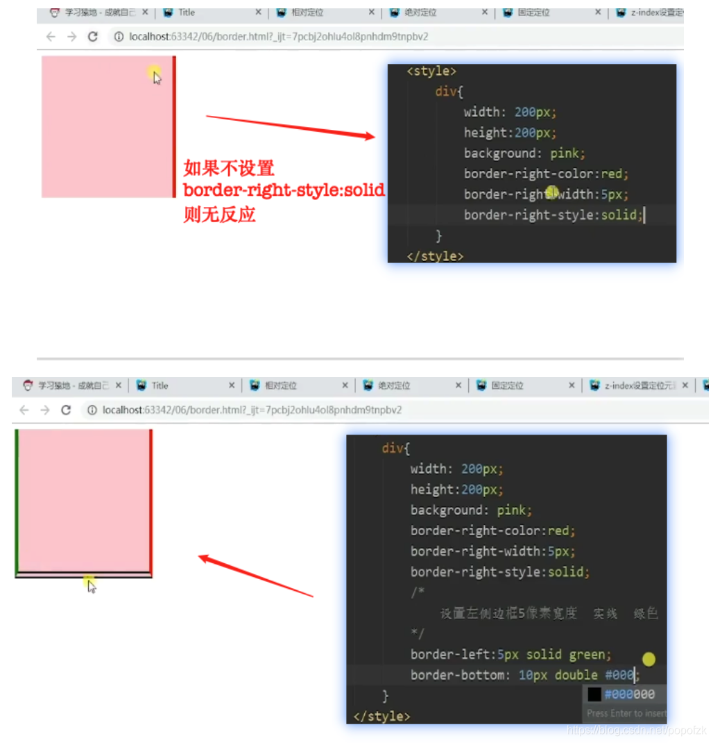
统一设置(大多数情况下):

双线注意:

padding

总结:
padding的宽高要记录在盒子模型的宽高之内,于此相同的是border也要记录在盒子模型的宽高之内,但是margin并不算在宽高之内。所以在书写宽高时注意减掉内边距和边框(标准盒模型)
宽高指的是content的!回顾如图:

1
2
3
4
5
6
7
8
9
10
11
12
13
14
15
16
17
18
19
20
21
22
23
24
25
26
27
28
29
30
31
32
33
34
35
36
37
| <!DOCTYPE html>
<html lang="en">
<head>
<meta charset="UTF-8">
<title>padding</title>
<style>
span{
border:1px solid red;
float:left;
padding: 10px 20px 30px 40px;
}
div{
width:150px;
height:150px;
background: red;
clear: both;
border:5px solid red;
padding: 20px;
/*
padding的宽高要记录在盒子模型的宽高之内,于此相同的是border也要记录在盒子模型的宽高之内,但是margin并不算在宽高之内。所以各位在书写宽高时注意减掉内边距和边框(标准盒模型)
*/
}
</style>
</head>
<body>
<span>这是内容</span>
<div></div>
</body>
</html>
|
怪异盒模型:


1
2
3
4
5
6
7
8
9
10
11
12
13
14
15
16
17
18
19
20
21
| <!DOCTYPE html>
<html lang="en">
<head>
<meta charset="UTF-8">
<title>怪异盒</title>
<style>
div{
width:200px;
height:200px;
padding:20px;
border:5px solid red;
background: red;
box-sizing: border-box;
}
</style>
</head>
<body>
<div></div>
</body>
</html>
|
div+css布局注意事项
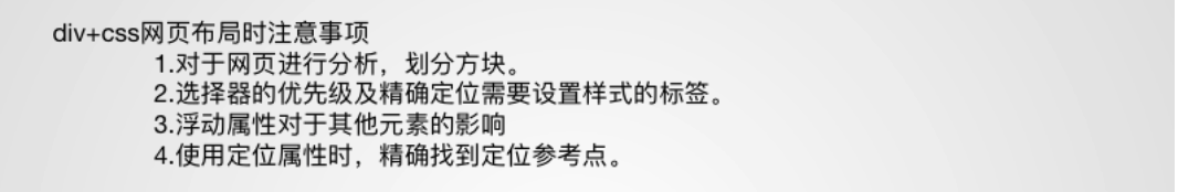
参考视频:
b站:一天学会DIV+CSS布局